Encoding numerical features
This section explains the way numerical encoding can be carried out using feature_encoders.
The SplineEncoder takes pandas.DataFrames as input and generates numpy.ndarrays as output.
[1]:
import numpy as np
import pandas as pd
import matplotlib.pyplot as plt

from sklearn.pipeline import make_pipeline
from sklearn.linear_model import LinearRegression

%matplotlib inline
[2]:
from feature_encoders.encode import SplineEncoder
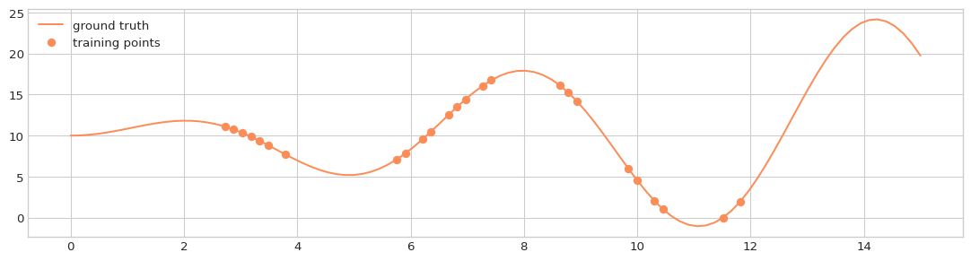
We can create some synthetic data:
[3]:
def f(x):
    return 10 + (x * np.sin(x))
[4]:
x_support = np.linspace(0, 15, 100)
y_support = f(x_support)

x_train = np.sort(np.random.choice(x_support[15:-15], size=25, replace=False))
y_train = f(x_train)
[5]:
X_train = pd.DataFrame(data=x_train, columns=['x'])
X_support = pd.DataFrame(data=x_support, columns=['x'])
[6]:
with plt.style.context('seaborn-whitegrid'):
    fig = plt.figure(figsize=(14, 3.5), dpi=96)
    layout = (1, 1)
    ax = plt.subplot2grid(layout, (0, 0))

    ax.plot(X_support, y_support, label='ground truth', c='#fc8d59')
    ax.plot(X_train, y_train, 'o', label='training points', c='#fc8d59')
    ax.legend(loc='upper left')
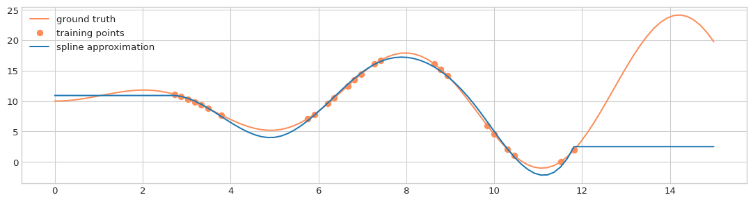
Cubic spline without extrapolation:
[7]:
enc = SplineEncoder(feature='x', n_knots=5, degree=3, strategy='uniform',
                        extrapolation='constant', include_bias=True,)

model = make_pipeline(enc, LinearRegression(fit_intercept=False))
model.fit(X_train, y_train)
pred = model.predict(X_support)

with plt.style.context('seaborn-whitegrid'):
    fig = plt.figure(figsize=(14, 3.5), dpi=96)
    layout = (1, 1)
    ax = plt.subplot2grid(layout, (0, 0))

    ax.plot(X_support, y_support, label='ground truth', c='#fc8d59')
    ax.plot(X_train, y_train, 'o', label='training points', c='#fc8d59')
    ax.plot(X_support, pred, label='spline approximation')
    ax.legend(loc='upper left')
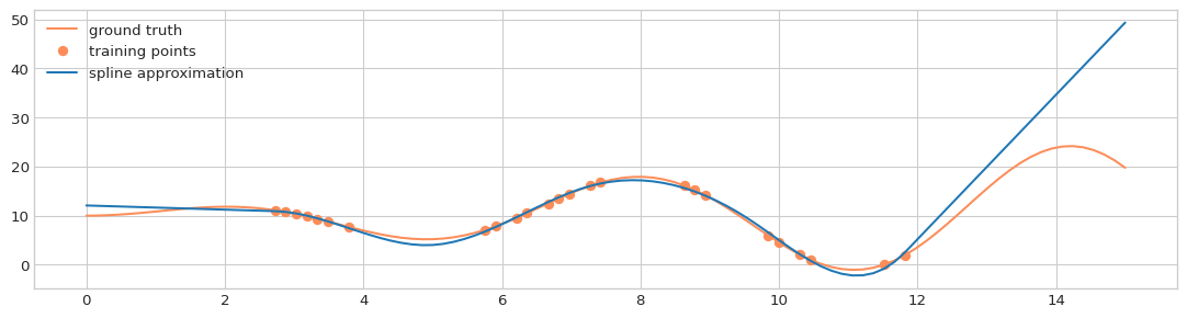
With linear extrapolation:
[8]:
enc = SplineEncoder(feature='x', n_knots=5, degree=3, strategy='uniform',
                        extrapolation='linear', include_bias=True,)

model = make_pipeline(enc, LinearRegression(fit_intercept=False))
model.fit(X_train, y_train)
pred = model.predict(X_support)

with plt.style.context('seaborn-whitegrid'):
    fig = plt.figure(figsize=(14, 3.5), dpi=96)
    layout = (1, 1)
    ax = plt.subplot2grid(layout, (0, 0))

    ax.plot(X_support, y_support, label='ground truth', c='#fc8d59')
    ax.plot(X_train, y_train, 'o', label='training points', c='#fc8d59')
    ax.plot(X_support, pred, label='spline approximation')
    ax.legend(loc='upper left')
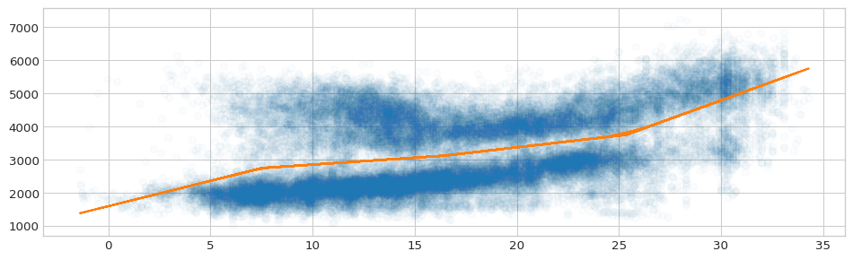
An application of the spline encoder
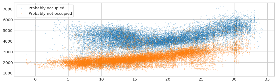
The TOWT model for predicting the energy consumption of a building estimates the temperature effect separately for hours of the week with high and with low energy consumption in order to distinguish between occupied and unoccupied periods.
To this end, a flexible curve is fitted on the consumption~temperature relationship, and if more than the 65% of the data points that correspond to a specific hour-of-week are above the fitted curve, the corresponding hour is flagged as “Occupied”, otherwise it is flagged as “Unoccupied.”
We can apply this approach using feature_encoders functionality.
Load demo data
[9]:
data = pd.read_csv('data/data.csv', parse_dates=[0], index_col=0)
data = data[~data['consumption_outlier']]
[10]:
dmatrix = SplineEncoder(feature='temperature',
                        degree=1,
                        strategy='uniform'
          ).fit_transform(data)

model = LinearRegression(fit_intercept=False).fit(dmatrix, data['consumption'])
pred = pd.DataFrame(
            data=model.predict(dmatrix),
            index=data.index,
            columns=['consumption']
       )
[11]:
with plt.style.context('seaborn-whitegrid'):
    fig = plt.figure(figsize=(12, 3.5), dpi=96)
    layout = (1, 1)
    ax = plt.subplot2grid(layout, (0, 0))

    ax.plot(data['temperature'], data['consumption'], 'o', alpha=0.02)
    ax.plot(data['temperature'], pred['consumption'])
[12]:
resid = data[['consumption']] - pred[['consumption']]
mask = resid > 0
mask['hourofweek'] = 24 * mask.index.dayofweek + mask.index.hour
occupied = mask.groupby('hourofweek')['consumption'].mean() > 0.65

data['hourofweek'] = 24 * data.index.dayofweek + data.index.hour
data['occupied'] = data['hourofweek'].map(lambda x: occupied[x])
[13]:
with plt.style.context('seaborn-whitegrid'):
    fig = plt.figure(figsize=(12, 3.5), dpi=96)
    layout = (1, 1)
    ax = plt.subplot2grid(layout, (0, 0))

    ax.scatter(data.loc[data['occupied'], 'temperature'],
               data.loc[data['occupied'], 'consumption'],
               s=2, alpha=0.2, label='Probably occupied')

    ax.scatter(data.loc[~data['occupied'], 'temperature'],
               data.loc[~data['occupied'], 'consumption'],
               s=2, alpha=0.2, label='Probably not occupied')

    ax.legend(fancybox=True, frameon=True, loc='upper left')